Healthcare · Campus App · 2023
Making healthcare access simple, supportive, and stigma-free for university students and staff.
Overview
UniCare helps UCD students and staff book medical appointments, access mental health resources, and get practical nutrition guidance — without confusing systems or phone-call gymnastics.
Goal: Reduce friction, reduce emotional load, and make the next step obvious — especially for students already under stress.
The Problem
Booking was phone-based, time-limited, and slow. Mental health support carried stigma and hesitation. Nutrition guidance was hard to access and easy to ignore.
The existing system made getting help feel like a part-time job — which is ironic when you're already juggling actual classes, work, and trying to remember to eat vegetables.
Process
From surveys and student conversations, a clear pattern emerged: students weren't just short on time — they were often already stressed before they even started.
Key insight: When users feel vulnerable, tone and clarity matter as much as functionality. Students needed accessible, judgment-free support that fit their already chaotic lives.
I mapped the health journey across a typical week and identified three key emotional moments — Frustration with multiple calls, Hesitation around mental health stigma, and Relief when support is quick and clear.
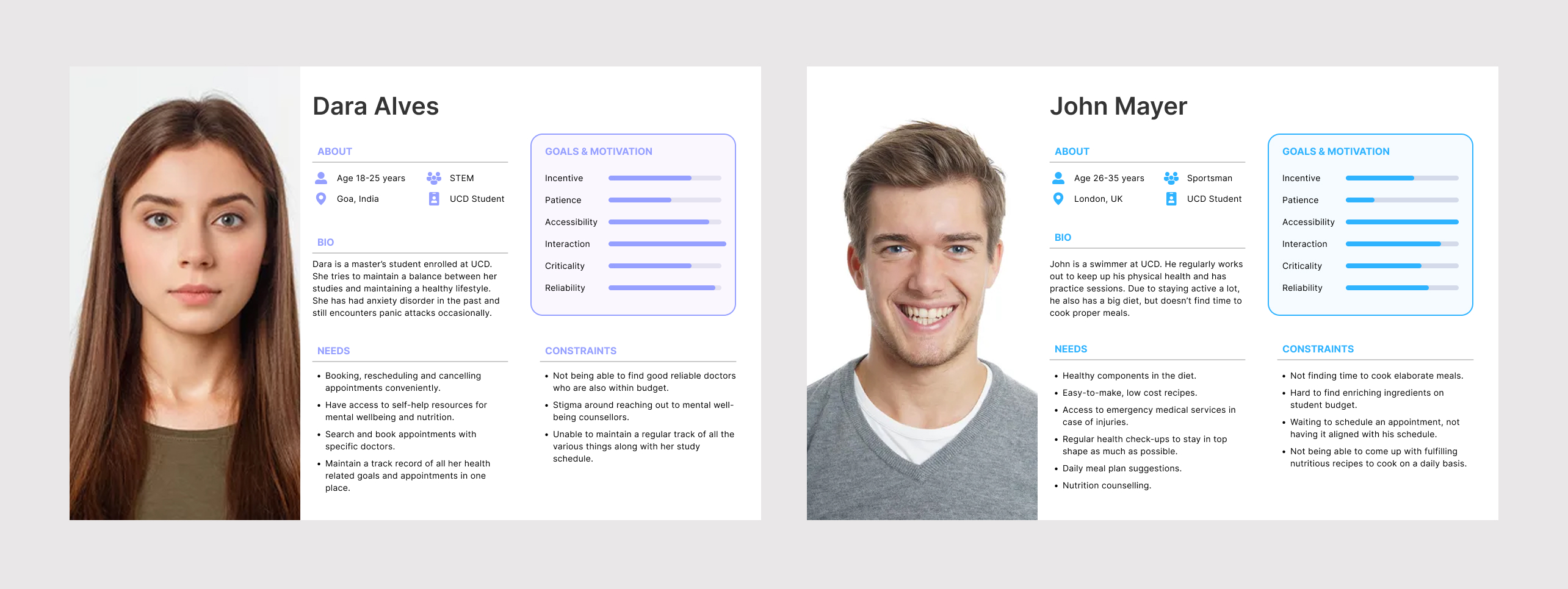
User personas — Dara (STEM master's student managing anxiety) and John (athlete balancing training and nutrition), each representing distinct needs that shaped the three-pillar platform structure.
I explored multiple layouts and iterated toward clear navigation for three distinct needs (Appointments / Mental Health / Nutrition), a booking flow with fewer steps, and resource pages that feel supportive, not overwhelming.
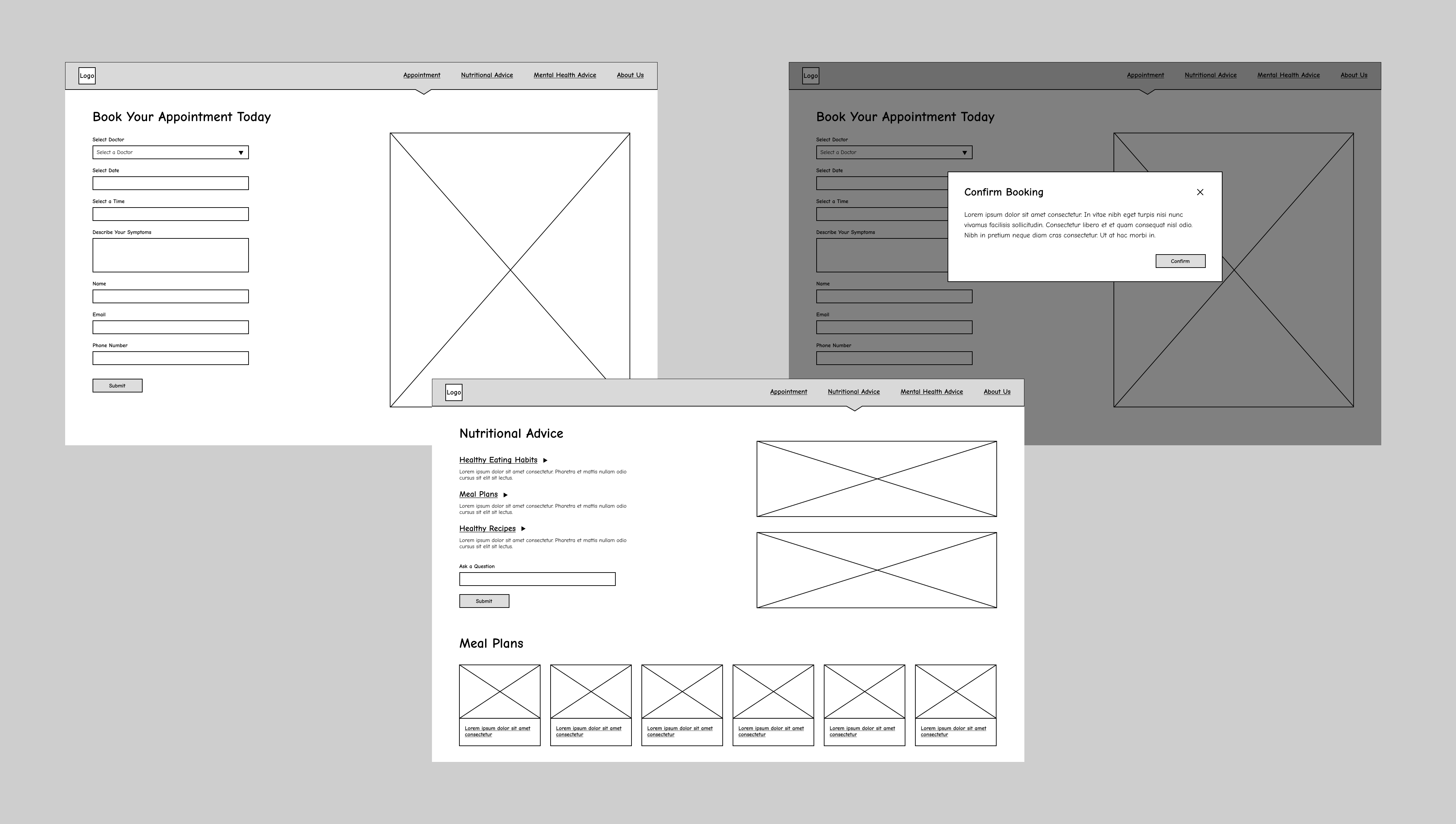
Early wireframes exploring the appointment booking flow — from selecting a doctor and date to the confirmation modal, keeping the process to the fewest possible steps.
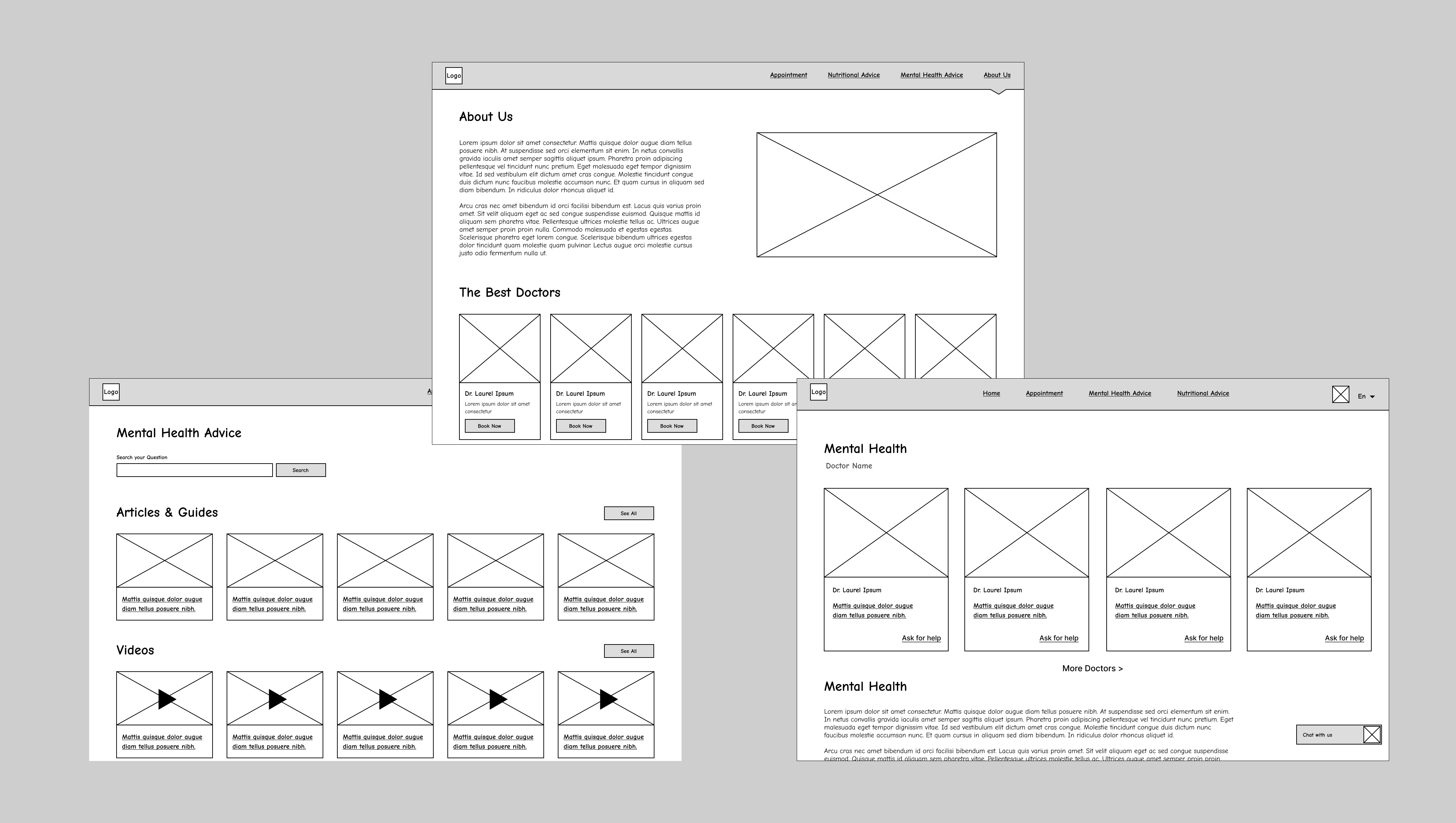
Wireframe explorations for the About Us, Mental Health Advice, and doctor listing pages — establishing information hierarchy and content structure before visual styling.
Design Decisions
Separated Pillars
Appointments, Mental Health, and Nutrition are clearly separated — reducing overwhelm and cognitive load.
Support-first Tone
Gentle, private language reduces stigma and hesitation around seeking mental health help.
Private Access Patterns
Self-help resources and gentle prompts lower the barrier to entry without forcing exposure.
Reduced Form Fields
Booking in 3 steps instead of 7 — because nobody wants to fill out their life story to see a doctor.
Final Interface
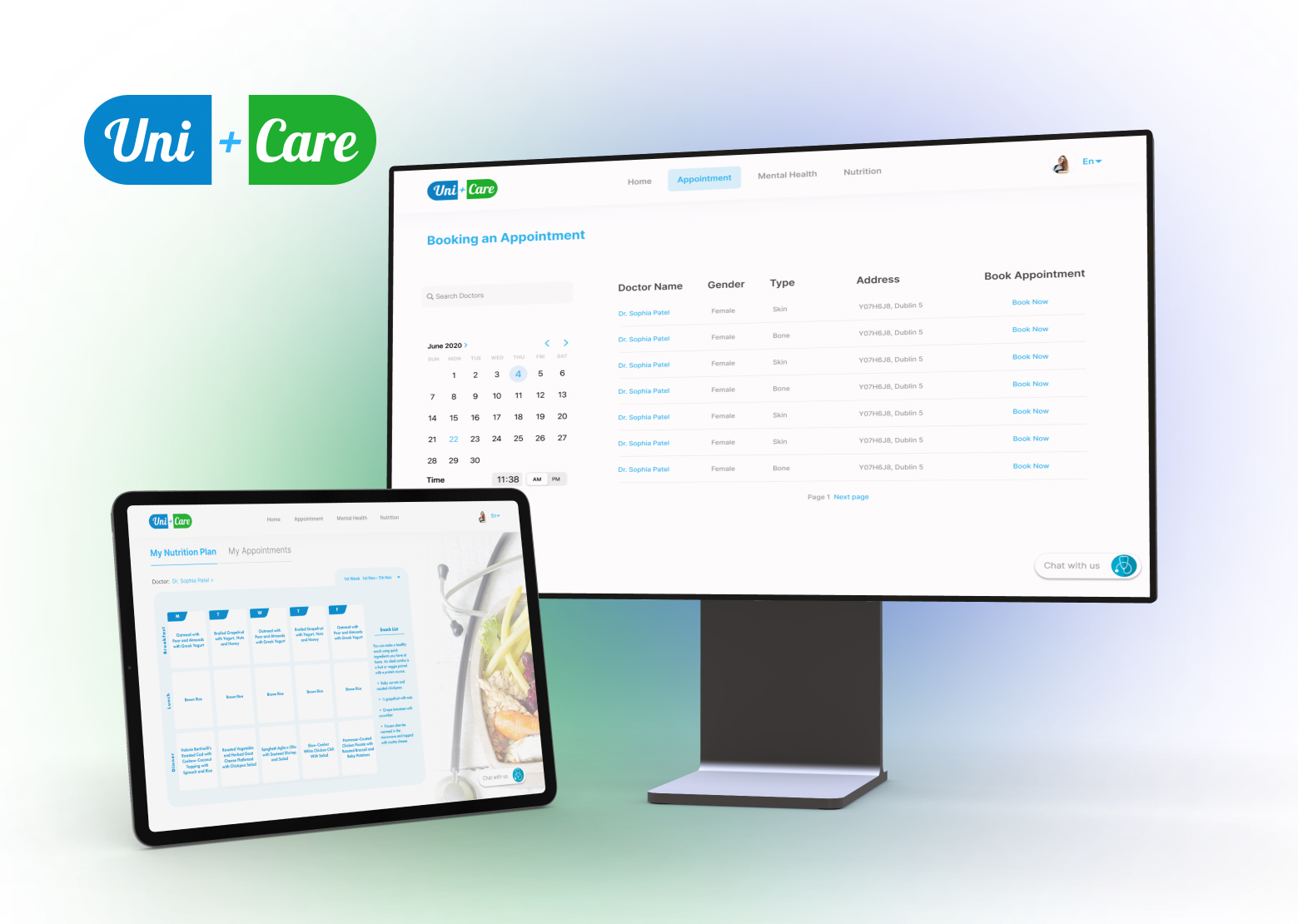
UniCare brings campus healthcare into one clear experience — Appointments to book GP/counseling with availability and confirmation, Mental Health guided resources with optional chat support, and Nutrition with practical meal guidance.
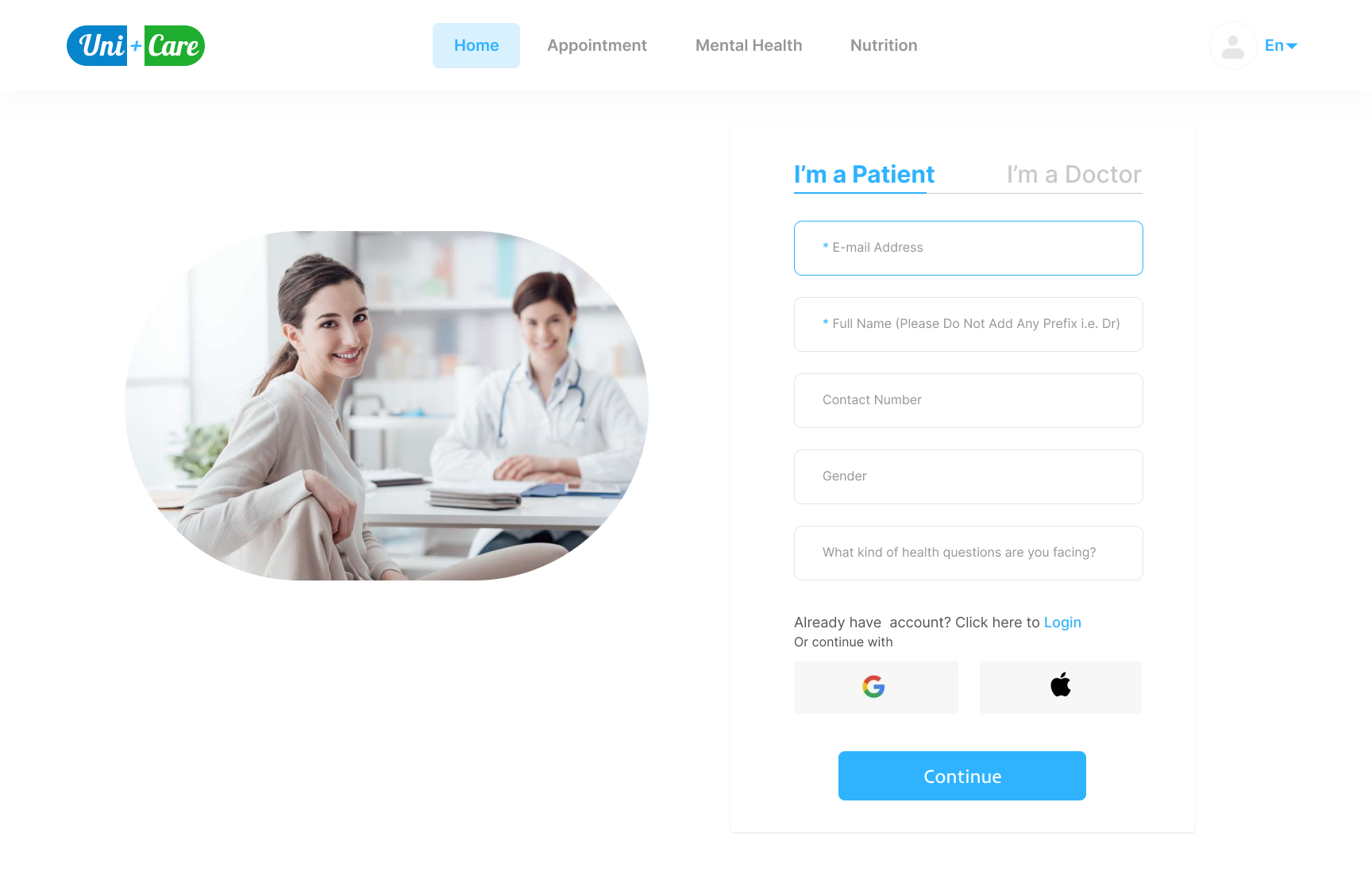
Onboarding screen — role-based entry (Patient / Doctor) with a minimal sign-up form, reducing friction from the very first interaction.
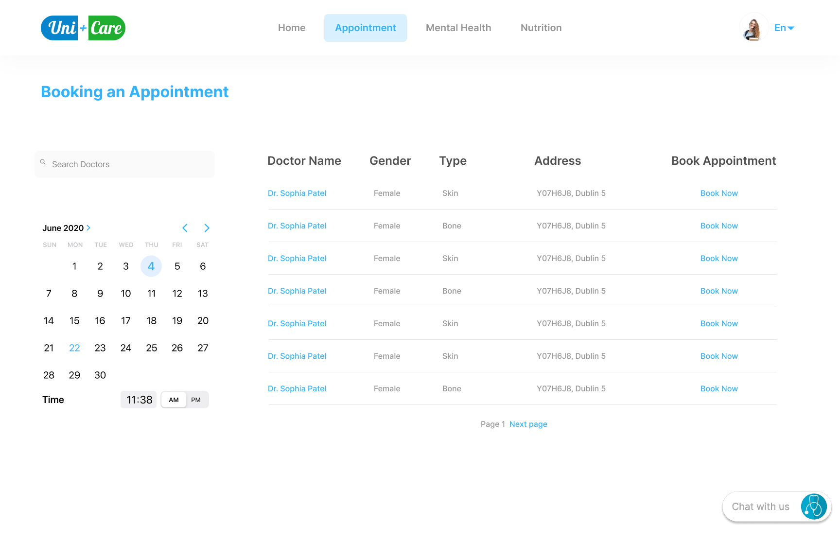
Appointment booking — students search for doctors, select a date and time from a calendar, and book in just a few steps without a phone call.
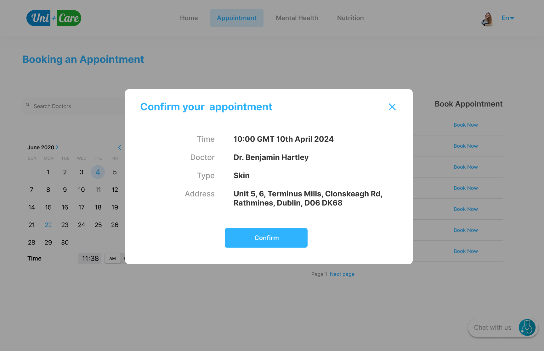
Confirmation modal — clear summary of doctor, time, type, and location before committing, reducing the "did it go through?" anxiety.
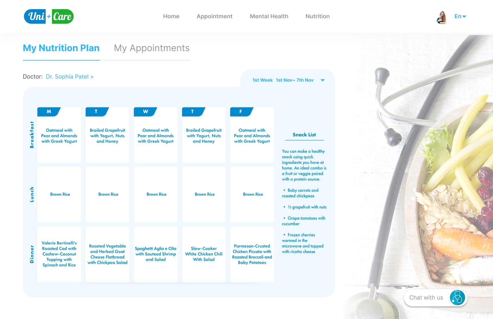
Nutrition plan — a personalised weekly meal plan prescribed by the student's doctor, with a snack list for easy daily reference.
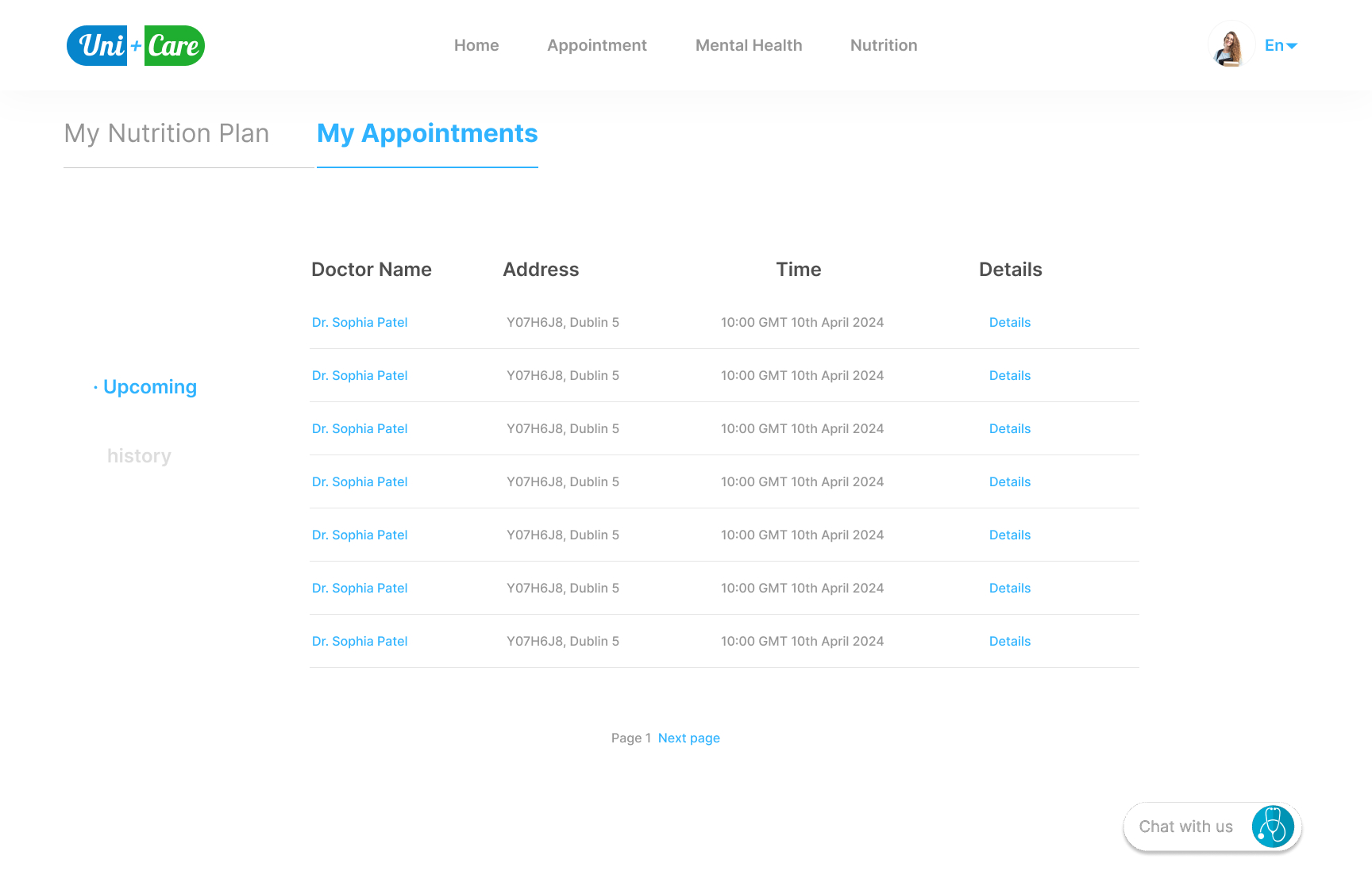
My Appointments — a clean log of upcoming and past appointments with doctor name, address, time, and a details link for full context.
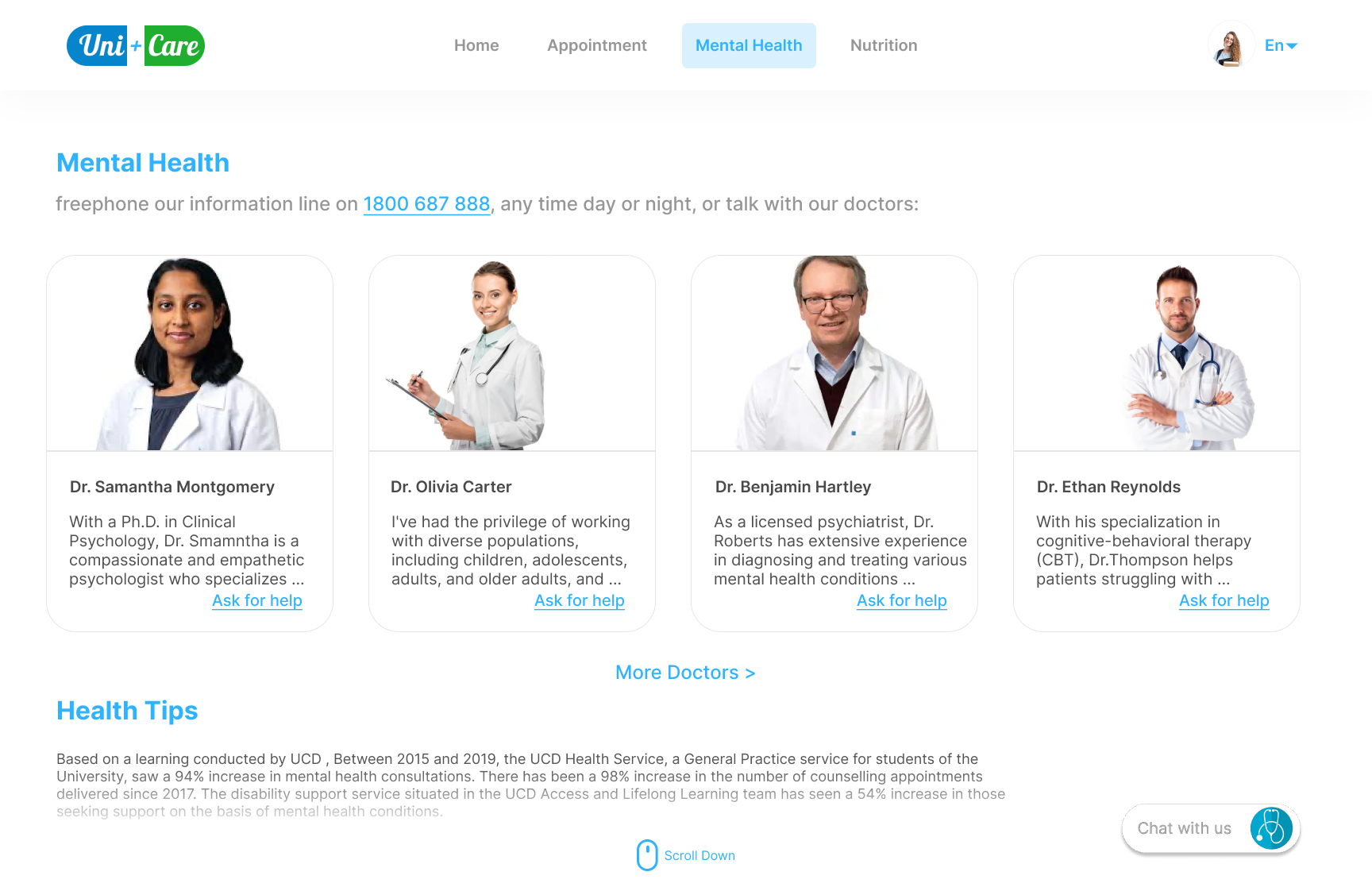
Mental Health section — a non-judgmental directory of counsellors and psychiatrists with a freephone support line, making it easy to ask for help without stigma.
Outcome
The result: Students can actually focus on getting better instead of navigating bureaucracy.
What I Learned
Designing for sensitive experiences taught me that clarity is empathy. When users are already overwhelmed, the UI shouldn't add friction — it should quietly guide them forward.
Small decisions — reducing field inputs, choosing softer language, providing private access — made meaningful differences in how students felt about seeking help.
Next Steps