Healthcare · Enterprise Dashboard · 2024
Redesigning a legacy clinical dashboard into a faster, clearer decision experience for healthcare professionals under pressure.
Overview
ARK supported healthcare teams in reviewing risk and patient information, but the experience was slow to scan and hard to trust under pressure.
Goal: Make ARK clear, fast, and reliable for high-stakes workflows by improving information hierarchy, reducing clutter, and standardising UI patterns.
The Problem
Doctors couldn't find critical patient info during emergencies. Manual workflows created delays. The UI felt inconsistent — adding stress when accuracy mattered most.
The platform was slow, cluttered, and felt like it was designed in 2008 (because it kind of was). Healthcare workers described it as "playing Where's Waldo during a crisis" — not ideal when lives are on the line.
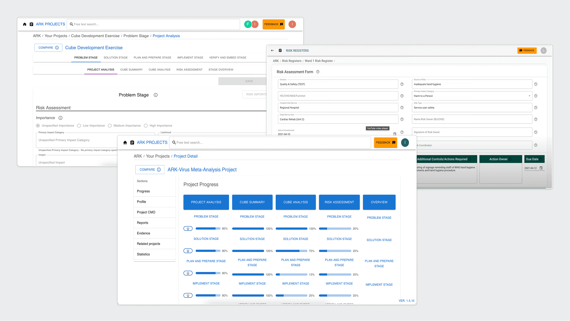
Before: high visual noise and unclear hierarchy created friction in high-stakes moments.
Process
I evaluated the current experience and aligned on the core usability risks: cognitive overload, poor prioritisation, and inconsistent interaction patterns.
Key insight: Users need prioritized signals, not more data.
I restructured the experience around role needs and core tasks, so the interface shows the right content at the right moment — without forcing users to scan everything.
Key findings: Each user group needed different information at different moments, but the platform treated everyone the same.
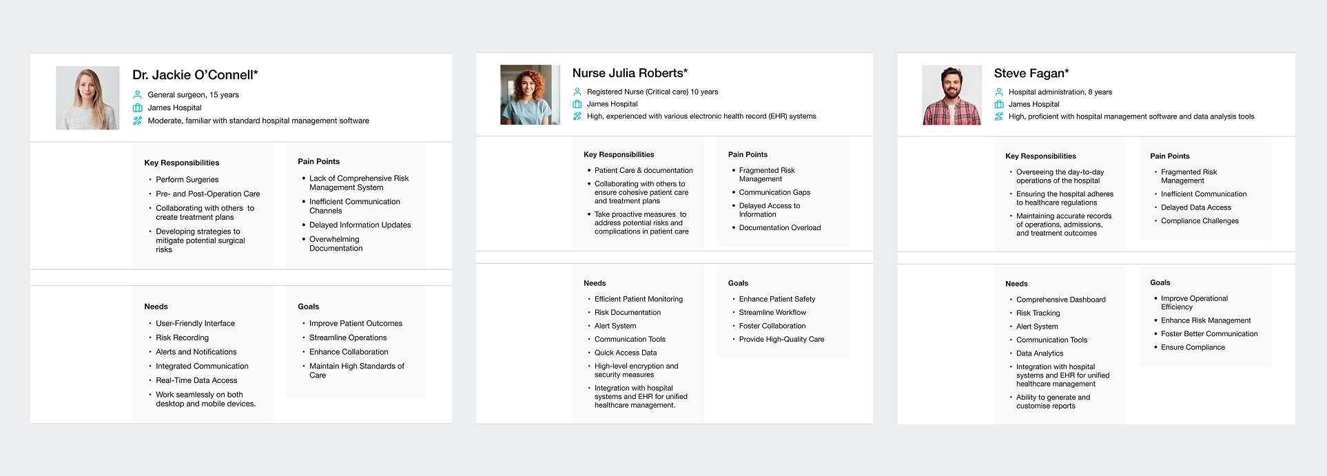
Three distinct user types with different priorities and decision-making contexts.
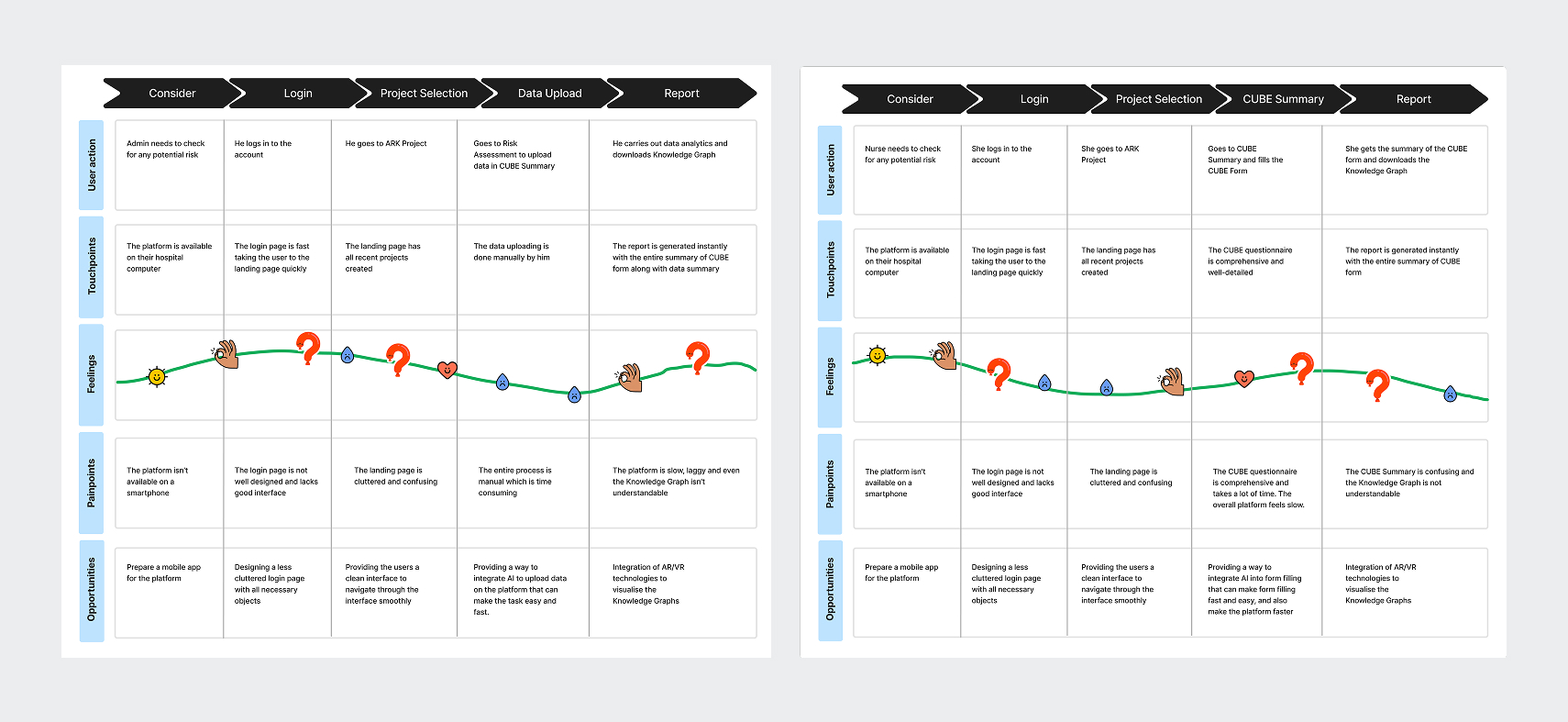
Journey Mapping conducted with hospital staff (Admin & Nurse) — mapping user actions, touchpoints, feelings, painpoints, and opportunities across five key stages.
I ran multiple wireframe rounds to remove clutter, strengthen hierarchy, and introduce progressive disclosure — moving from data-dense screens to decision-first layouts.
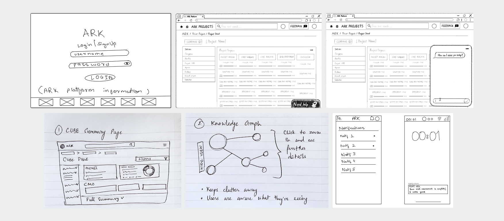
Wireframe evolution: from information overload to layered disclosure and clear hierarchy.
Design Decisions
Progressive Disclosure
Over dense dashboards — reduces cognitive load, improves focus on what matters most.
Card Hierarchy over Tables
Faster scanning, clearer grouping, and naturally responsive-friendly.
Restrained Alert System
Avoids alarm fatigue while still highlighting critical risks clearly.
Reusable Design System
Scalable foundations prevent future clutter and ensure visual consistency.
Final Interface
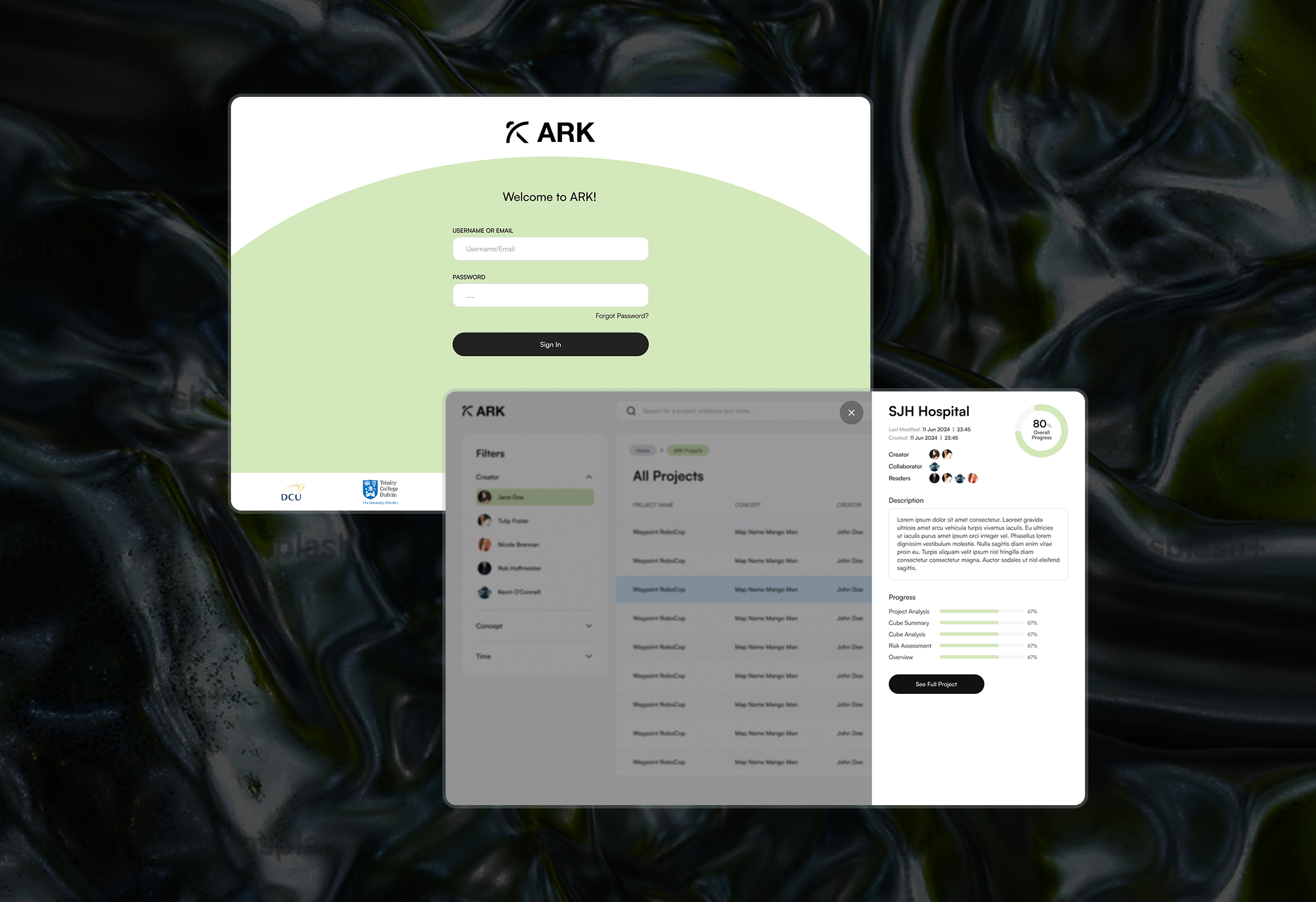
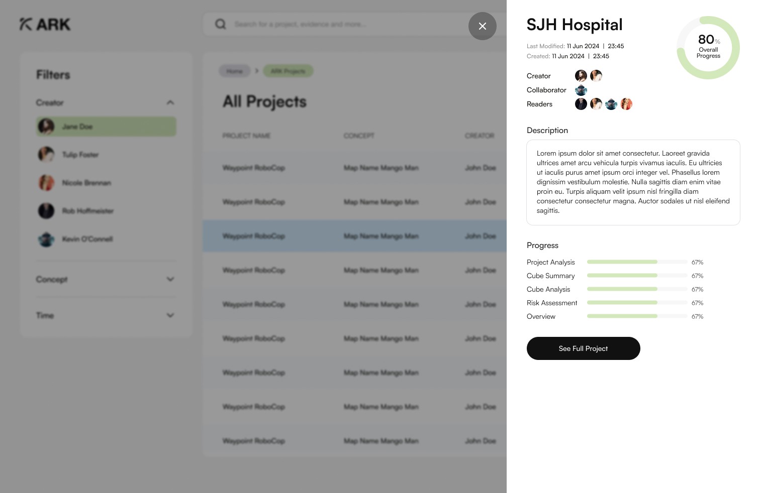
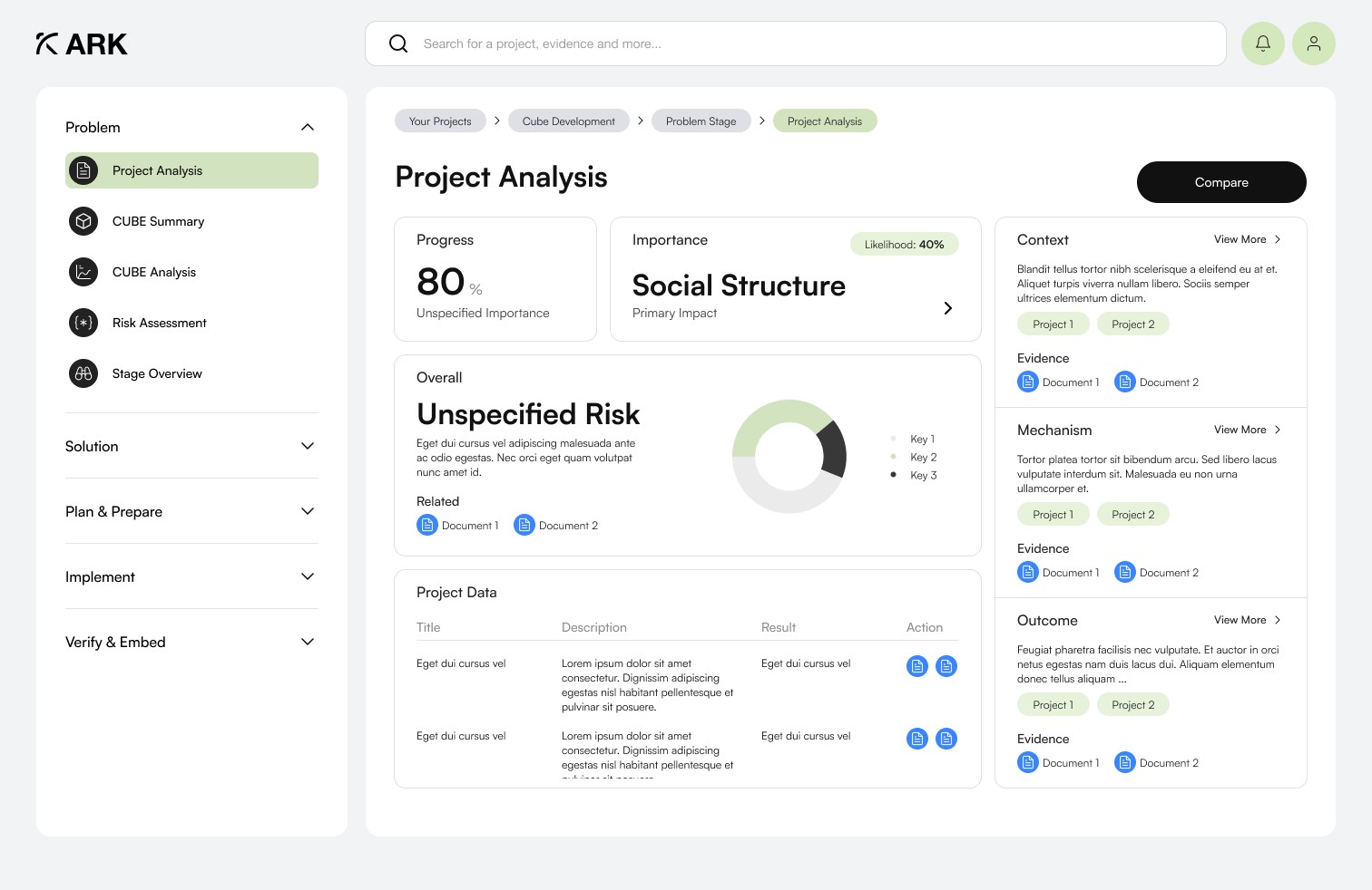
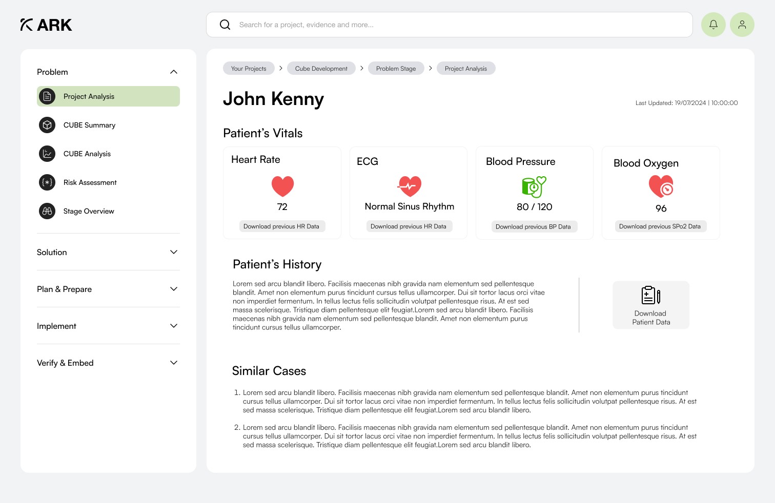
The final UI is calm, structured, and prioritised — so users can spot what matters immediately and access deeper details only when needed.
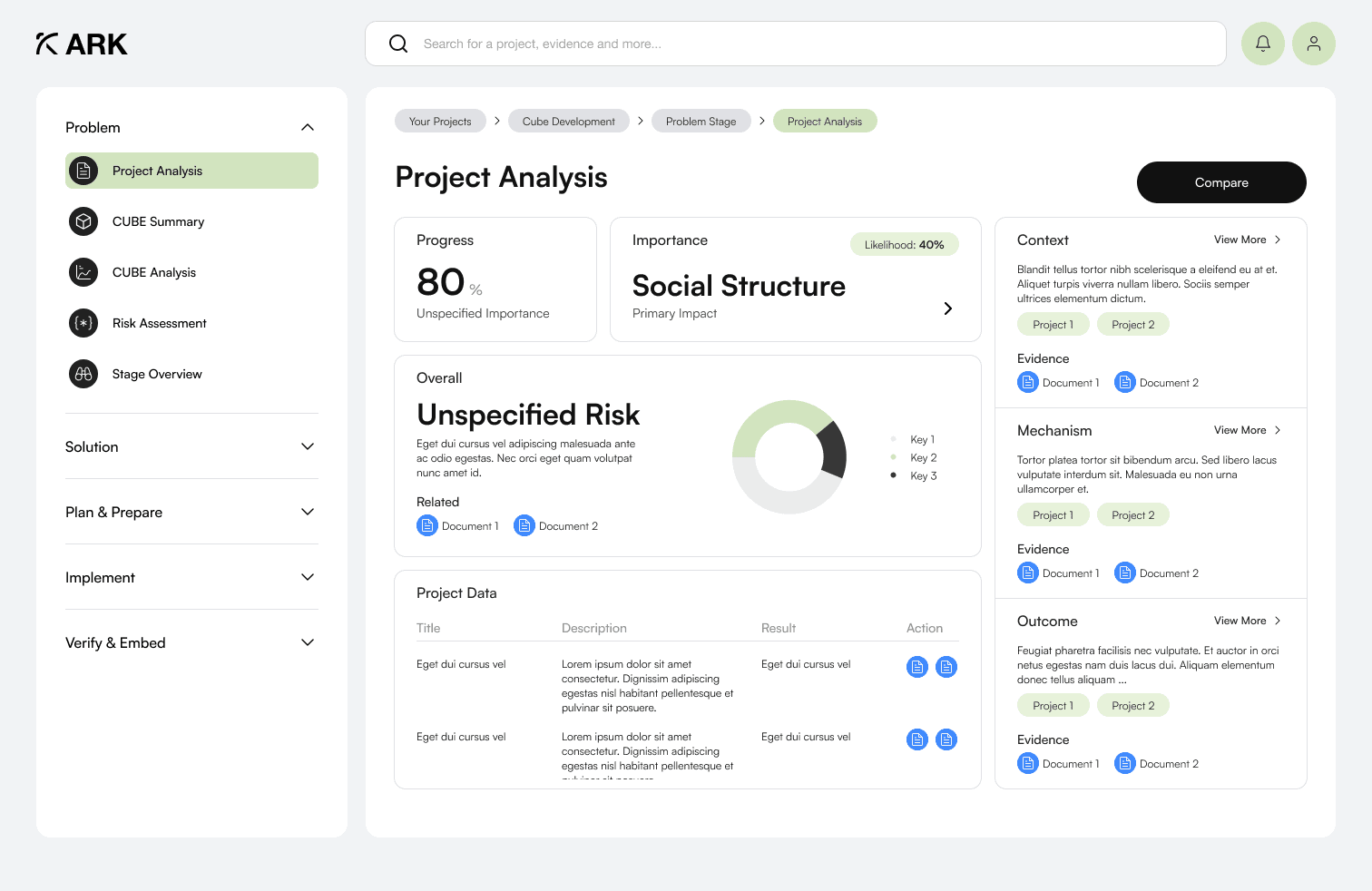
Final redesigned dashboard built for rapid scanning and prioritized risk signals.
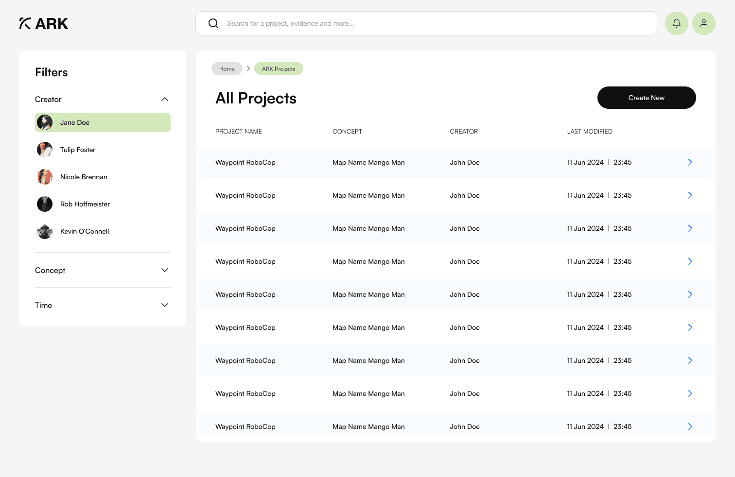
Design System
I built a lightweight design system to keep the experience consistent and scalable — preventing future clutter.
Foundations
Typography scale, spacing, tokens, colour usage
Components
Buttons, inputs, cards, badges, alerts, navigation
Patterns
Empty/error/loading states, table/card behaviour
Accessibility
Contrast, focus states, keyboard behaviour
Outcome
The result: Healthcare teams could focus on care, not hunting for information.
Next Steps